

Online marketing can be complicated, especially when it comes to SEO. There are so many different factors you need to consider, from keyword selection to on-page optimisation and link building. Even if you do your research and figure out what you need to do, how will you know if it’s working? With the recent launch of Search Console’s bubble chart, SEO professionals now have access to highly detailed data that can help them identify and improve their sites’ SEO performance with ease. In this guide, we’ll take you through the process of identifying areas where you could improve your site’s performance by viewing and interpreting Search Console bubble charts.
What is a Search Console Bubble Chart?
The Search Console Bubble Chart displays the number of impressions and clicks for specific search queries and corresponding landing pages over time. The chart helps SEO consultants understand the performance of their SEO campaigns and provide actionable insights on how they can improve performance.

Understanding Search Console Bubble Chart
The search console bubble chart can provide valuable insight into how well (or poorly) your website performs in search. This handy bubble chart tool shows you what percentage of impressions, clicks, and other types of data fall into certain ranges. It’s useful for SEO consultants and webmasters who want to assess and optimise their website’s performance.
Various Elements of Search Console Bubble Chart
There are various elements found in search console bubble chart. SEO consultants can benefit from getting to know the various elements found in the Google search console bubble chart.
Data Source
This chart uses data from the Site Impression table, which includes Search performance information from the Search Console that’s been aggregated by site and query.

Five Options for Data Control
To make it easy for you to maintain control of your data, you have five different customisation options in the chart.
Data Control: Here you’ll be able to decide what you want to examine.
From/to date range: Choose the from and to date range you’d like to see in the report. The default range is set to last 28 days.
Query: Add or remove queries in order to narrow down your search.
Country: Add or Remove countries.
Devices: Determine if you want to add the kind of devices included in the project.
Axes
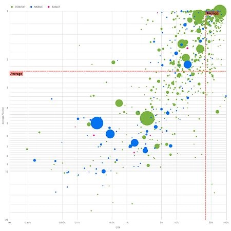
On the chart, you can see Average position on the y-axis and Site CTR on the x-axis.
Inverted Y- Axis: Typically, the y-axis denotes average position, which is better displayed by flipping it. So, for business charts, flipping the y-axis is what intuitive for an average position in the top right.
Logarithmic Scale: With a logarithmic scale, every number is a 10-fold increase from the previous one. For both axes, log scaling gives you a better picture of the data you want to represent (very low CTR, average position, or both).
Ref Line: One other kind of margin is the reference line, which is especially helpful for displaying numbers that are above or below a particular threshold. By comparing data like the average, median, or a certain percentile, we can observe patterns that deviate from what is usually seen.
Bubbles
There is a bubble in the chart for each search term, and to make the chart more useful, there are two styling properties.

Number of clicks (Size): To keep track of the queries that matter most, larger bubbles are associated with queries that receive more traffic.
Usage (Colour): Considering the device category as the bubble colour helps you identify the difference between mobile and desktop search performance. Any of the dimensions can be assigned a colour, but the more dimensions, the harder it is to see patterns.
How to Analyse Data Using Search Console Bubble Chart
The Bubble Chart allows you to analyse how users are clicking on search results; to find out which keywords have more competition, and which have less; and to find out what terms people are searching for in order to access a specific page on their site.
The aim of this chart is to help spot opportunities for query optimisation. As the y-axis reflects average ranking, the x-axis is CTR, the size of the bubble reflects the number of clicks, and the colour reflects the type of device used.
High Performing Queries & High CTR: They require very little additional effort; in those cases, you don’t need to change much.
Low Performing Queries & High CTR: These queries are pertinent to the user. They have a high click-through rate even when they rank lower than the average search term on your website. They could represent a significant contribution if their position rises. So, consider investing in improving their ranking!
Low Performing Queries & Low CTR: While low performing queries with low CTR seems to be unworthy of your effort, but they can be categorised into related and unrelated queries. If the search query is crucial for you, have it showing up on your search often. Always, give priority to these search terms that are no appearing on your search results, so it will be easier to optimise. If the search term you are seeing is unrelated to your business, optimise your content to queries that are more relevant.
High Performing Queries & Low CTR: Those queries that are ranking high on the search results may not get more clicks due to any of the following reasons.
- Your competitors might have structured data markup and they’re showing up with rich results which might encourage users to click their links instead of yours.
- There is a chance that you optimised for a query that is not a popular subject in relation to your site.
- It’s possible that the user has already found the information they needed, such as your company’s opening hours, address, or phone number.
Tips to Optimise Your Website Using Collected Data
When you have identified good queries, optimise them with the help of the professionals from a leading SEO company. Here are a few tips that help you optimise your website using the collected data from Search Console’s bubble chart.
- Be sure that your title elements, description meta tags, and alt attributes are as detailed and accurate as possible.
- For optimal readability, make use of headings to give the user a clear idea of what content they are reading and make it easier for search engines to be able to browse your content.
- Include structured data markup in your webpages to improve search engine optimisation, allowing your site to show up more attractively in search results.
Think about what words users might use to find your content on the internet. Use Google Ads’ Keyword Planner to discover new keyword variations and get the estimated search volume for each keyword. You can also use Google Trends to find popular searches and trends related to your website.